Standard Elements
Top Strip
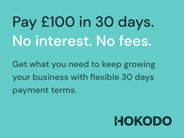
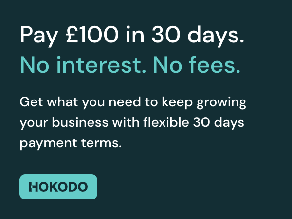
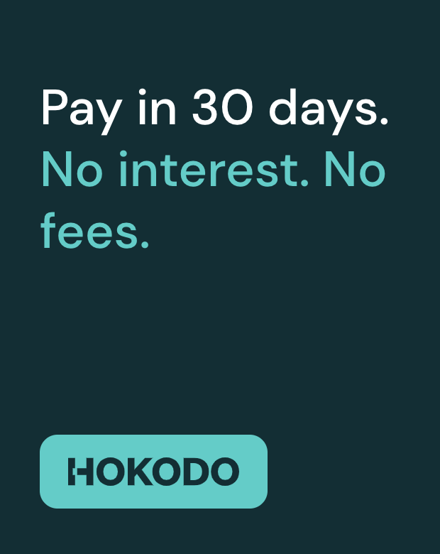
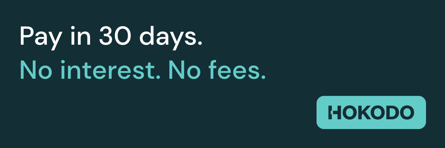
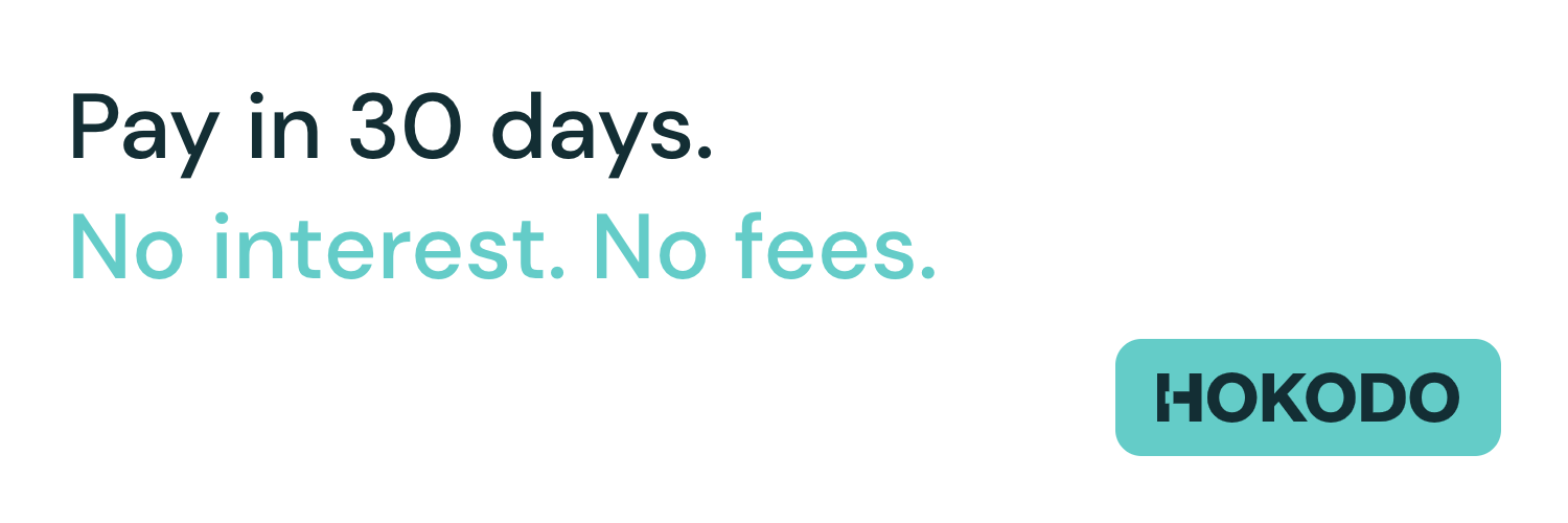
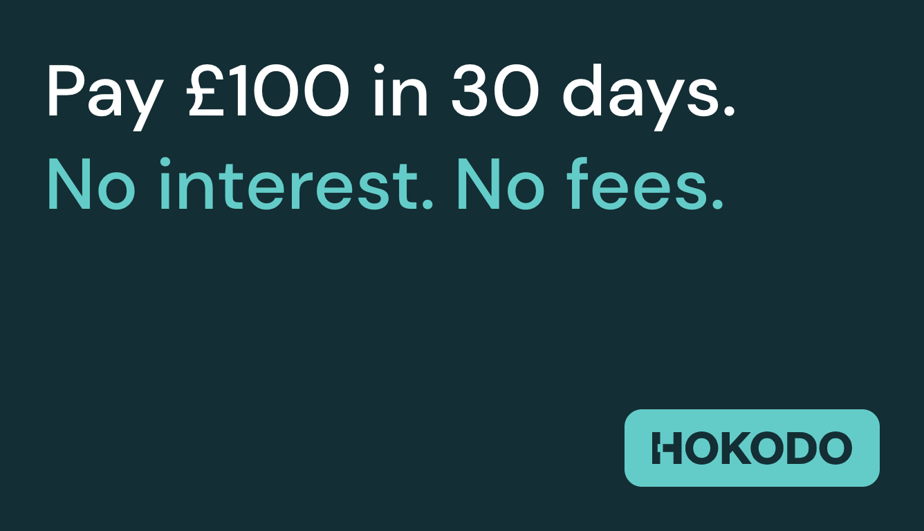
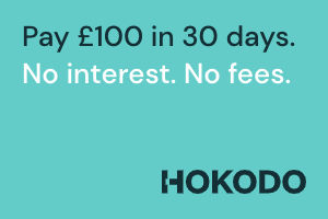
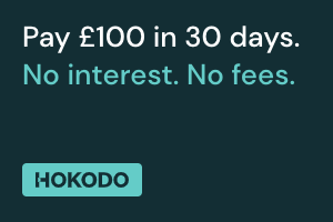
A top strip which is displayed on the homepage and all subsequent pages is a great way of letting customers know that Hokodo is available as a checkout option. It allows for clear messaging but is also subtle and won’t take up too much space on your website’s pages.
- Default
- Dark
- Light


Usage
<hokodo-marketing
  data-element="top-strip"
  data-theme="dark"
  data-total-amount="10000"
></hokodo-marketing>
| Parameter | Required | Default | Description |
|---|---|---|---|
| data-element | true | Type of the banner element. Top Strip is available in two variants, top-strip and mobile-top-strip | |
| data-theme | false | default | Available options are default, dark and light. |
| data-total-amount | false | Customer order amount in pence/cents. |
Leaderboard
A Leaderboard banner can sit at the top of a page, before products are listed. It could also feature alongside similar size banners that might be promoting a certain brand, product or another promotion.
- Default
- Dark
- Light


Usage
<hokodo-marketing
  data-element="leaderboard-small"
  data-theme="dark"
  data-total-amount="10000"
></hokodo-marketing>
| Parameter | Required | Default | Description |
|---|---|---|---|
| data-element | true | Type of the banner element. Leaderboard banner is available in leaderboard-small, leaderboard-medium, leaderboard-large, leaderboard-xlarge, mobile-leaderboard-small and mobile-leaderboard-medium variants. | |
| data-theme | false | default | Available options are default, dark and light. |
| data-total-amount | false | Customer order amount in pence/cents. |
Rectangle
This banner has room for additional text and can give a bit more information about Hokodo and the benefits buyers can expect. This would be well positioned on the homepage so buyers are instantly aware of the service Hokodo provides.
- Default
- Dark
- Light

Usage
<hokodo-marketing
  data-element="rectangle-small"
  data-theme="dark"
  data-total-amount="10000"
></hokodo-marketing>
| Parameter | Required | Default | Description |
|---|---|---|---|
| data-element | true | Type of the banner element. Rectangle banner is available in rectangle-small, rectangle-medium, rectangle-large and rectangle-xlarge variants. | |
| data-theme | false | default | Available options are default, dark and light. |
| data-total-amount | false | Customer order amount in pence/cents. |
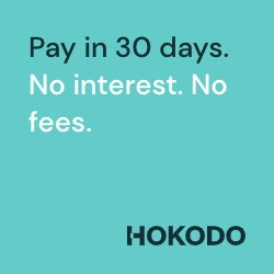
Square
These banners are versatile and can be placed on multiple different pages of your website. For example, they could be used alongside previews of certain product categories.
- Default
- Dark
- Light


Usage
<hokodo-marketing
  data-element="square-small"
  data-theme="dark"
></hokodo-marketing>
| Parameter | Required | Default | Description |
|---|---|---|---|
| data-element | true | Type of the banner element. Square banner is available in square-small and square-medium variants. | |
| data-theme | false | default | Available options are default, dark and light. |
| data-total-amount | false | Customer order amount in pence/cents. |
Portrait
This longer, thinner banner can be placed on the left of a category page. For example below the section where a buyer might filter by product brand/colour/size etc.
- Default
- Dark
- Light


Usage
<hokodo-marketing data-element="portrait" data-theme="dark"></hokodo-marketing>
| Parameter | Required | Default | Description |
|---|---|---|---|
| data-element | true | Type of the banner element. | |
| data-theme | false | default | Available options are default, dark and light. |
| data-total-amount | false | Customer order amount in pence/cents. |
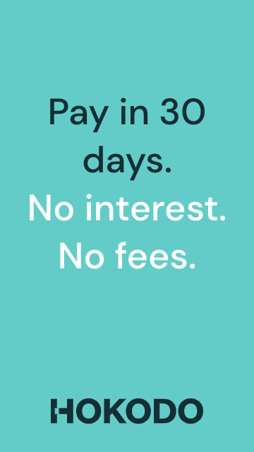
Vertical Banner
This can be used if you have more vertical space as opposed to square space for banners on your website.
- Default
- Dark
- Light


Usage
<hokodo-marketing
  data-element="vertical-banner"
  data-theme="dark"
></hokodo-marketing>
| Parameter | Required | Default | Description |
|---|---|---|---|
| data-element | true | Type of the banner element. | |
| data-theme | false | default | Available options are default, dark and light. |
| data-total-amount | false | Customer order amount in pence/cents. |
Hero
This banner can be placed in the hero section of your website to make customers instantly aware of Hokodo and the payment options available to them. This would be especially useful when Hokodo is first launched on your website.
- Default
- Dark
- Light

Usage
<hokodo-marketing data-element="hero" data-theme="dark"></hokodo-marketing>
| Parameter | Required | Default | Description |
|---|---|---|---|
| data-element | true | Type of the banner element. | |
| data-theme | false | default | Available options are default, dark and light. |
| data-total-amount | false | Customer order amount in pence/cents. |
Cover
If you have a carousel of large banners at the top of your homepage, this banner can be added to highlight the payment options available to them. If it is used in a carousel, it can be used alongside other banners promoting certain products and deals.
- Default
- Dark
- Light

Usage
<hokodo-marketing
  data-element="cover"
  data-theme="dark"
  data-total-amount="10000"
></hokodo-marketing>
| Parameter | Required | Default | Description |
|---|---|---|---|
| data-element | true | Type of the banner element. | |
| data-theme | false | default | Available options are default, dark and light. |
| data-total-amount | false | Customer order amount in pence/cents. |
Mobile Banner
This banner is similar to our square/rectangle banners and can be used to promote Hokodo on mobile devices.
- Default
- Dark
- Light

Usage
<hokodo-marketing
  data-element="mobile-banner"
  data-theme="dark"
  data-total-amount="10000"
></hokodo-marketing>
| Parameter | Required | Default | Description |
|---|---|---|---|
| data-element | true | Type of the banner element. | |
| data-theme | false | default | Available options are default, dark and light. |
| data-total-amount | false | Customer order amount in pence/cents. |
Lightbox
A Lightbox pop-up is a useful way of giving customers a bit more information on how Hokodo works and how easy it is to access the flexible payment options available to them. It can pop-up after clicking/hovering on a Hokodo badge, or be shown to logged in business customers.

Usage
<hokodo-marketing data-element="lightbox"></hokodo-marketing>
| Parameter | Required | Default | Description |
|---|---|---|---|
| data-element | true | Type of the banner element. |
Badge
These small badges can go in the footer of your website, where you highlight the payment options available (e.g. Visa, Mastercard, PayPal). They can also be used as icons/buttons to link to a Hokodo FAQs page.
- Default
- Dark
- Light
Usage
<hokodo-marketing
  data-element="badge-large"
  data-theme="dark"
></hokodo-marketing>
| Parameter | Required | Default | Description |
|---|---|---|---|
| data-element | true | Type of the banner element. The available badge variants are badge-small and badge-large | |
| data-theme | false | default | Available options are default, dark and light. |